

Earlier this month, the Milwaukee Bucks unveiled their new 2018-19 "City" uniforms, a garish yellow kit that pays homage to the team’s former Mecca arena. Love ‘em or hate ‘em, the Bucks will only wear these unis for one season before Nike rolls out a whole new "City" collection for every team.
But even though we will only see those duds for 12 games – beginning on Monday, Nov. 19 at home against Denver – before they go back in the closet, it’s still a good time to parse through the entire Wisconsin sports style scene. Here is a definitive ranking of all 11 uniforms in America’s Dairyland, alternates and all.
11. Packers’ blues (alternate)
 (PHOTO: Jim Biever/Green Bay Packers)
Hard pass on 1930s era throwbacks. Part of the problem is that it’s a tad disturbing to see the Packers in anything other than the traditional green and gold, especially with the block ‘G’ logo peeled off the helmets. The gold shoulder pads are also obnoxiously bright, and the brown pants are too muted. While Pittsburgh’s bumblebee retro unis have actually become part of the Steelers brand, the Green Bay alternates remain unpleasant and disorienting. Stick with the green.
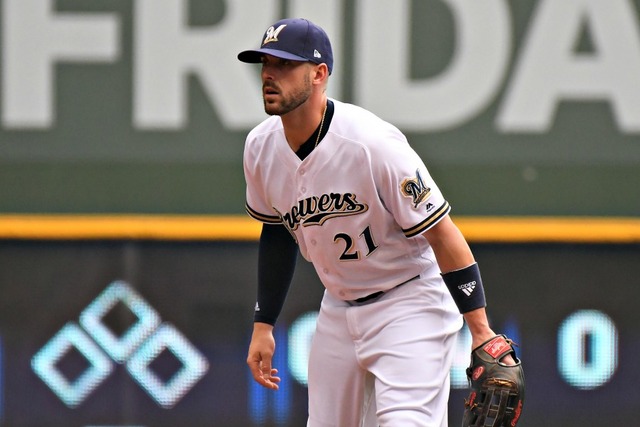
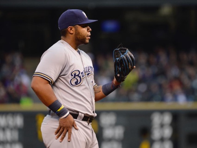
10. Brewers’ whites (home)
 (PHOTO: David Bernacchi)
Home whites should be the uniform staple of a baseball team, but the Brewers tend to shy away from their own white kits, only wearing them 28 times in 173 regular season and postseason games this past year. The Brewers’ home uniforms aren’t terrible, but they could use an update – and in Wisconsin when most of the state’s uniforms are top-shelf, these clearly lag behind. One feature in particular is a nuisance: the gold shading around the navy blue numbers and letters does not pop enough off the white, making the figures feel a little narrow for a sports uniform.
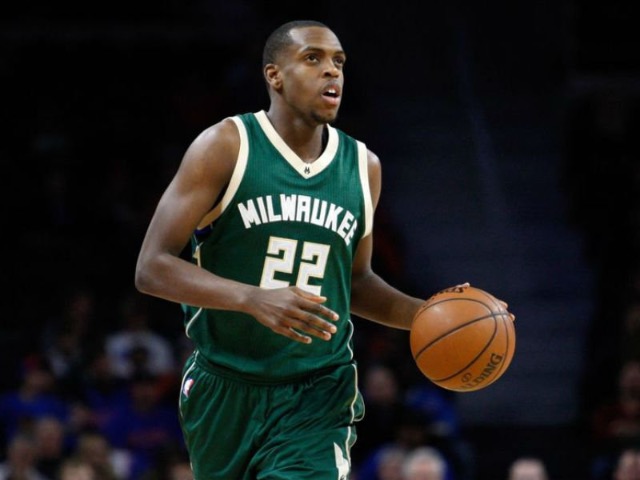
9. Bucks’ yellows (City)
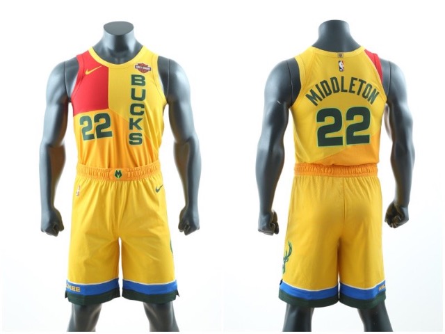
These bad boys are yet to actually debut under the big lights, so this is only a temporary ranking. And you have to give the Bucks – and Nike – credit for going against the grain with a flashy, retro look. At least we didn’t get the standard blah gray alternate that a few other franchises are using. Still, it feels like this jersey could have more accurately resembled the old Mecca. Uniform guru Paul Lukas tweeted out a potential Bucks jersey that embodies the look and feel of the Mecca much more than Nike’s current attempt. Good idea, poor execution. Let’s try again next year.
8. Brewers’ grays (road)
Road grays in baseball have a low ceiling and high floor, and the Brewers’ edition is no different. They aren’t super exciting, but they are crisp and clean, and no one is going to complain.
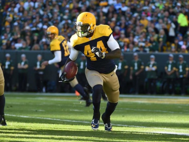
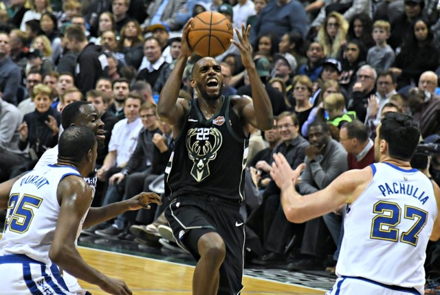
7. Bucks’ blacks (alternate)
 (PHOTO: David Bernacchi)
I have a couple uniform philosophies, and one is to stop the spread of black alternate uniforms. After this year’s round of "City" kits added to the midnight mayhem, 22 of the 30 teams in the NBA will wear a black uniform at some point this season, including Milwaukee. Despite my crotchetiness, however, the Bucks’ black uniforms are solid, and the cream color really bursts along the side stripes and the outline of the logo. (An all black-and-cream uniform would be sweet. Take note, Nike.) I don’t really love the giant Buck in the center of the jersey – I prefer the lettering across the front rather than the full logo – but these duds are still enjoyable nonetheless.
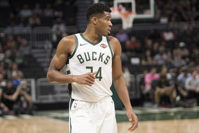
6. Bucks’ whites (Association)
 (PHOTO: Dan Garcia)
The NBA no longer has home and away uniforms; now they are "Icon" and "Association" (whatever that means). Either way, I really enjoy the Bucks’ white/"Association" uniforms. Even though Milwaukee only just rebranded before the 2015-16 campaign, these still have a timeless feel. The white unis allow for the green trim to breathe a bit more than on the black alternates and they show off the unique font across the chest.
5. Brewers’ blues (alternate)
 (PHOTO: David Bernacchi)
Just as the Bucks’ black uniform mostly overcomes my disdain for such alternates in the NBA, the Brewers’ blue uniform supersedes my contempt for colored jerseys in baseball. The Red Sox’s decision to wear their alternates in six of their 14 playoff games this year actually irked me. Just wear your dang classics! It’s the postseason! You’re the Boston Red Sox!
Anyways, I digress: I actually enjoy the Brewers’ blue uniforms, specifically the ones that feature the retro glove logo. That gold trim looks so good, and the logo with the M and the B intertwining to create a glove is so much better than the Brewers’ current stock M. It’s time to scrap these; just roll with your good stuff.
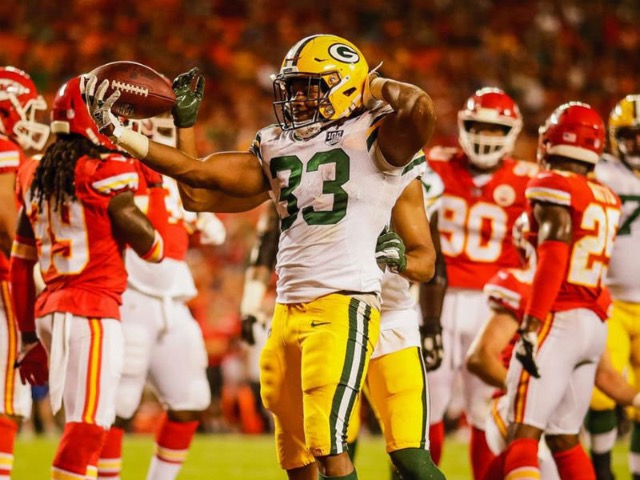
4. Packers’ whites (road)
 (PHOTO: Evan Siegle/Packers.com)
These puppies are nice. Not a whole lot to say here, but for the most part, the Packers uniforms put the rest of the NFL to shame.
3. Bucks’ greens (Icon)
 (PHOTO: Milwaukee Bucks Facebook)
Green is such a phenomenally rich color, yet so few NBA teams choose to feature it, which is what makes these Bucks’ "Icon" jerseys so special. The uniforms just explode with what the team calls "good land green," something that stands out amongst the monotonous red-and-blue wave throughout the rest of the league. The Boston Celtics famously wear green, of course, but every other franchise has left the shamrock hue behind. Props to Milwaukee for not only carrying on with the green tradition, but also emphasizing it with one of the league’s sharper uniforms.
2. Packers’ green and golds (home)
 (PHOTO: Evan Siegle/Packers.com)
The Packers worked through countless duds before finally settling on the green-and-gold color scheme in 1959, and after a few tweaks here and there, Green Bay has fielded the same look since 1997. Well done. What remains is one of the most recognizable uniforms in sports for one of the most iconic franchises in the country. In football, pairing a dark-colored jersey on top of lighter-colored pants – with a matching helmet to boot – is typically the way to go. Think about Notre Dame, the Los Angeles Rams, or the Oakland Raiders. They all feature celebrated uniforms that were built upon the same formula, something the Packers have similarly mastered.
1. Brewers’ pinstripes (throwback alternate)
It’s a near-crime that these alternate uniforms are not the Brewers’ everyday set. I don’t even care if the other team is wearing white unis – wear these pinstriped beauties underneath your road jersey for all I care. All I know is that these uniforms were meant to be worn on a baseball diamond.
The pinstripes are a wonderful touch, and the royal blue and yellow mix is so much sharper and more distinct than the current navy blue and gold morass. Toss in that gem of a logo and the fact that the Brewers went to their lone World Series with these uniforms, and it’s a total no brainer to return to these kits. These throwbacks are not simply novelty items that are fun to wear every now and again; they are far and away Milwaukee’s best uniform.
The Brewers have slowly inched toward the old days recently, incorporating the glove logo on more merchandise and even wearing these throwbacks 18 times in 2018. It’s time to go all-in and return to the glory days full-time.